


Sassen Design featured in the book Abstract Logo
Super happy with this one, the logo created for Volare Photography has been featured in the book Abstract Logo published by Counter Print.

Invitation design
Kirsten wanted something special for her 40th birthday invitation design along with a few requirements. It had to be printed on a 100% recycled stock, use Australian wildflowers and needed to be A5 in size, here's the final result and Kirsten was wrapped!
360 degree photos with Google Street View
Google released the iPhone app Street View, allowing anyone with iPhone to create and upload 360 images to Google maps. I've been experimenting with the app seeing how it works. These are my first test runs using Google Street View. Once a Street view has been uploaded it can be embedded in a website using a iFrame.
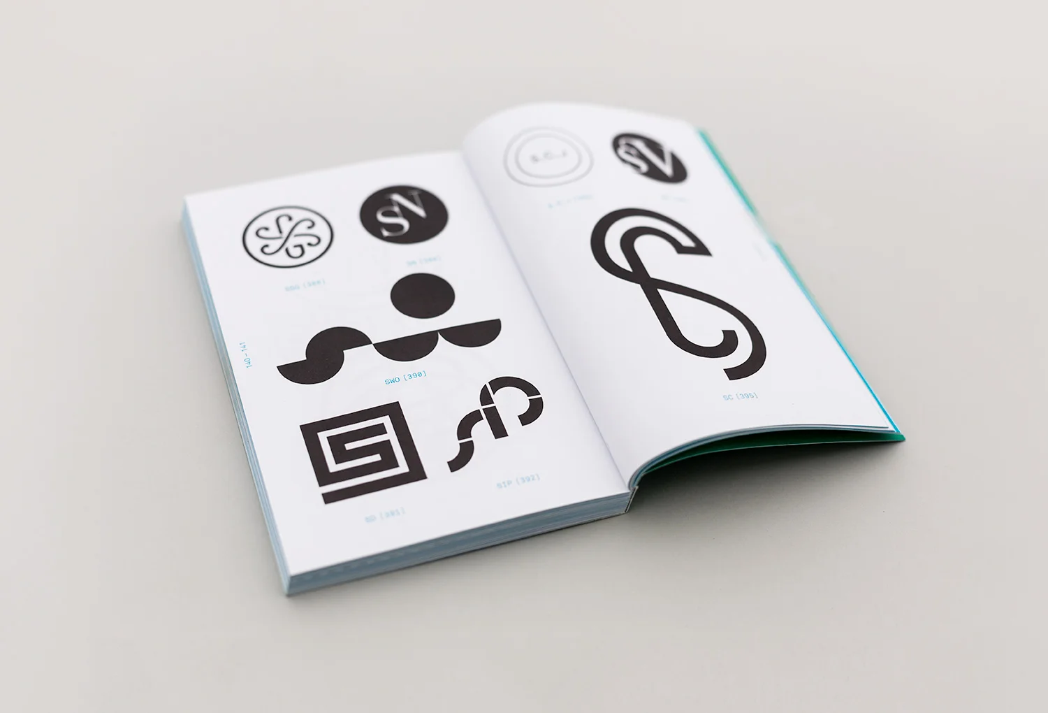
Sassen Design featured in the book Monogram Logo
The new Sassen Design logo, shown bottom left, has been featured in the book Monogram Logo by UK publisher Counter Print.
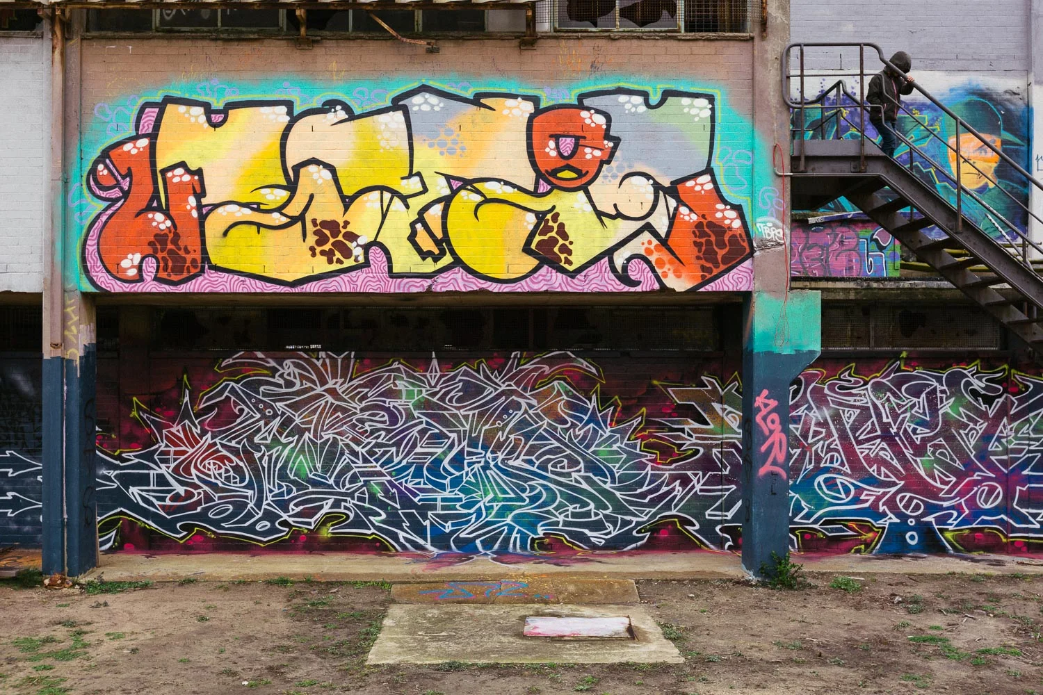
Powerhouse Geelong - Industrial Street Art Space
I made the drive from Melbourne to the Powerhouse in Geelong to meet a friend to take photos. The Powerhouse is a industrial street art space. The building was a power station which has been empty since it was abandoned 45 years ago. The art space includes a 3,000sqm building, sits on 6 acres of land and is Australia’s largest indoor legal space for street art.


Pixelstick light painting photography
A new photography offering from all of the other photography offerings on Kickstarter… Pixelstick.
Photography lights designed by photographers for photographers, awesome, I backed the project, waited, followed the updates on Kickerstarter and then they arrived in the mail.
I've been experimenting with my Pixelstick with various locations, camera settings and patterns and loving the effects that can be created, there's no way this could be created in Photoshop.


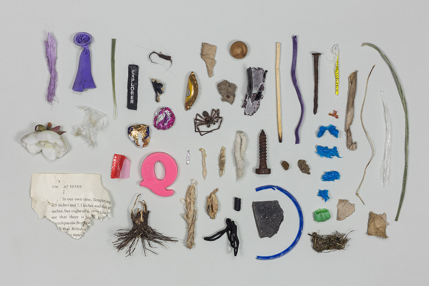
Warning! Whippet choking hazards
This image documents shows a range of objects that have been removed from the mouth of my Whippet puppy over the course of 6 weeks. He loved to chew anything. All items where safely removed and disposed off.

Victoria + Mark
Nothing beats a good wedding, along with the opportunity to take images on the day. Victoria's and Marks wedding was held at the the Albert Park Yachting & Angling Club, over looking the ocean. Here’s my favourite images from their special day. These images have been post-processed in Lightroom using VSCO Film.


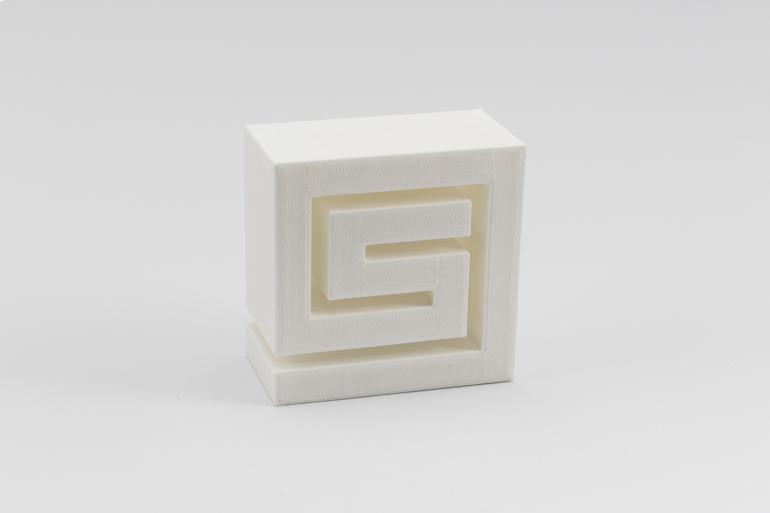
3D printing a logo in white
My first attempt at 3D printing with the Sassen Design logo
My first attempt at 3D printing with the Sassen Design logo.
The steps involved with 3D printing are fairly straight forward.
- The artwork is created in Adobe Illustrator and exported as a .DWG file
- The .DWG file is opened in Google SketchUp and extruded to taste
- The file is then exported from SketchUp as a .STL file
- The .STL file is opened in MakerBox and is scaled to size
- It can then be sent to print – this took around 3.5 hours to print.
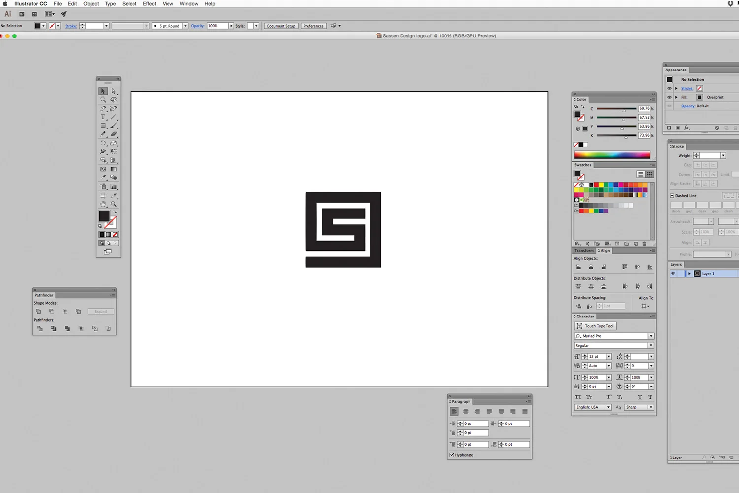
Step 1 The artwork is created in Adobe Illustrator and exported as a .DWG file
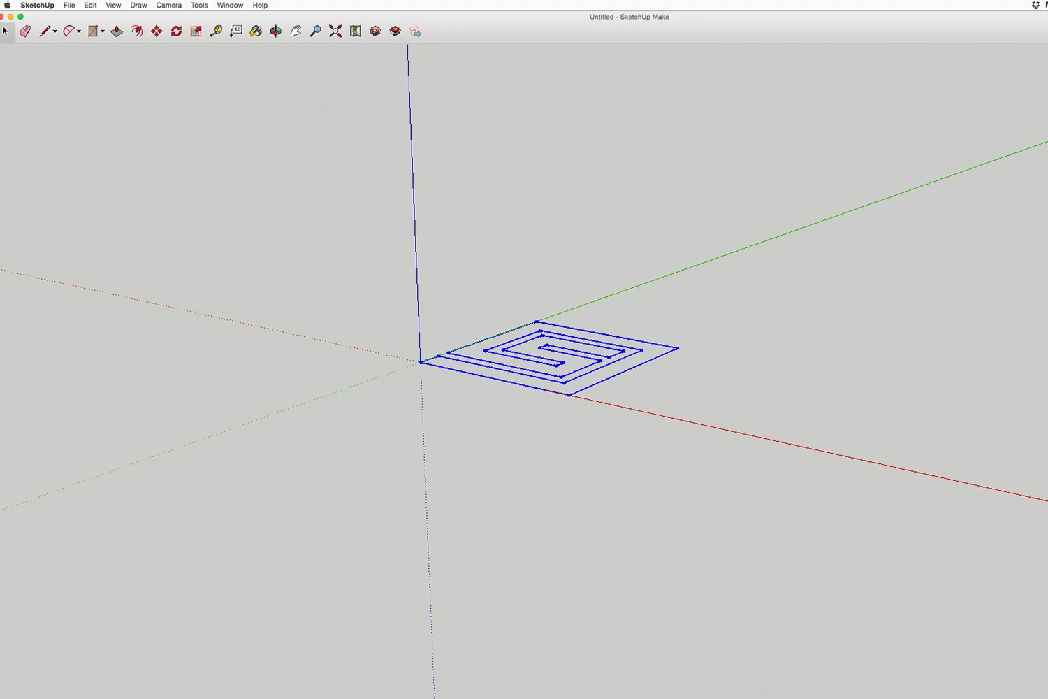
Step 2 The .DWG file is opened in Google SketchUp and extruded to taste
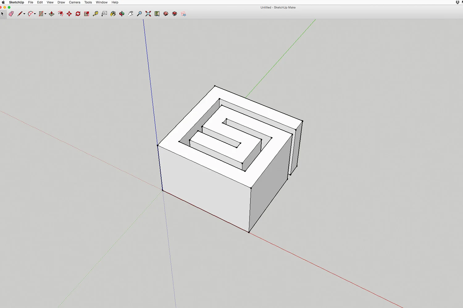
Step 3 The file is then exported from SketchUp as a .STL file
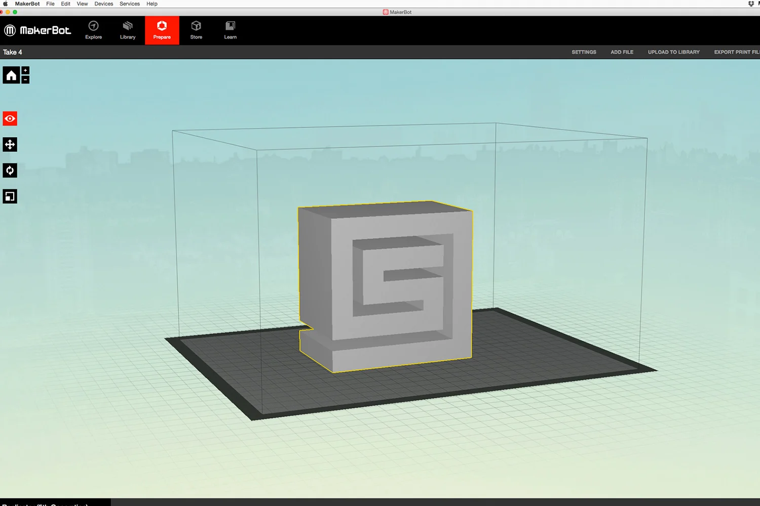
Step 4 The .STL file is opened in MakerBox and is scaled to size
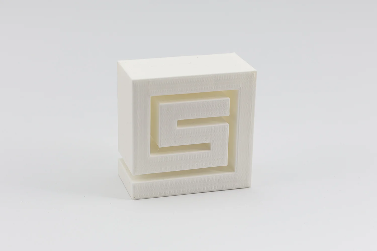
Step 5 It can then be sent to print – this took around 3.5 hours to print and is 60mm in height
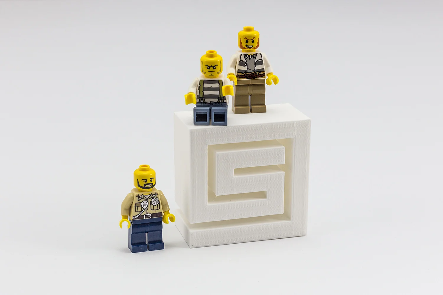
Step 6 The final product
Helvetica Christmas card

Sassen Design Christmas card created with Helvetica Bold. The card design highlights the anatomy of a font.

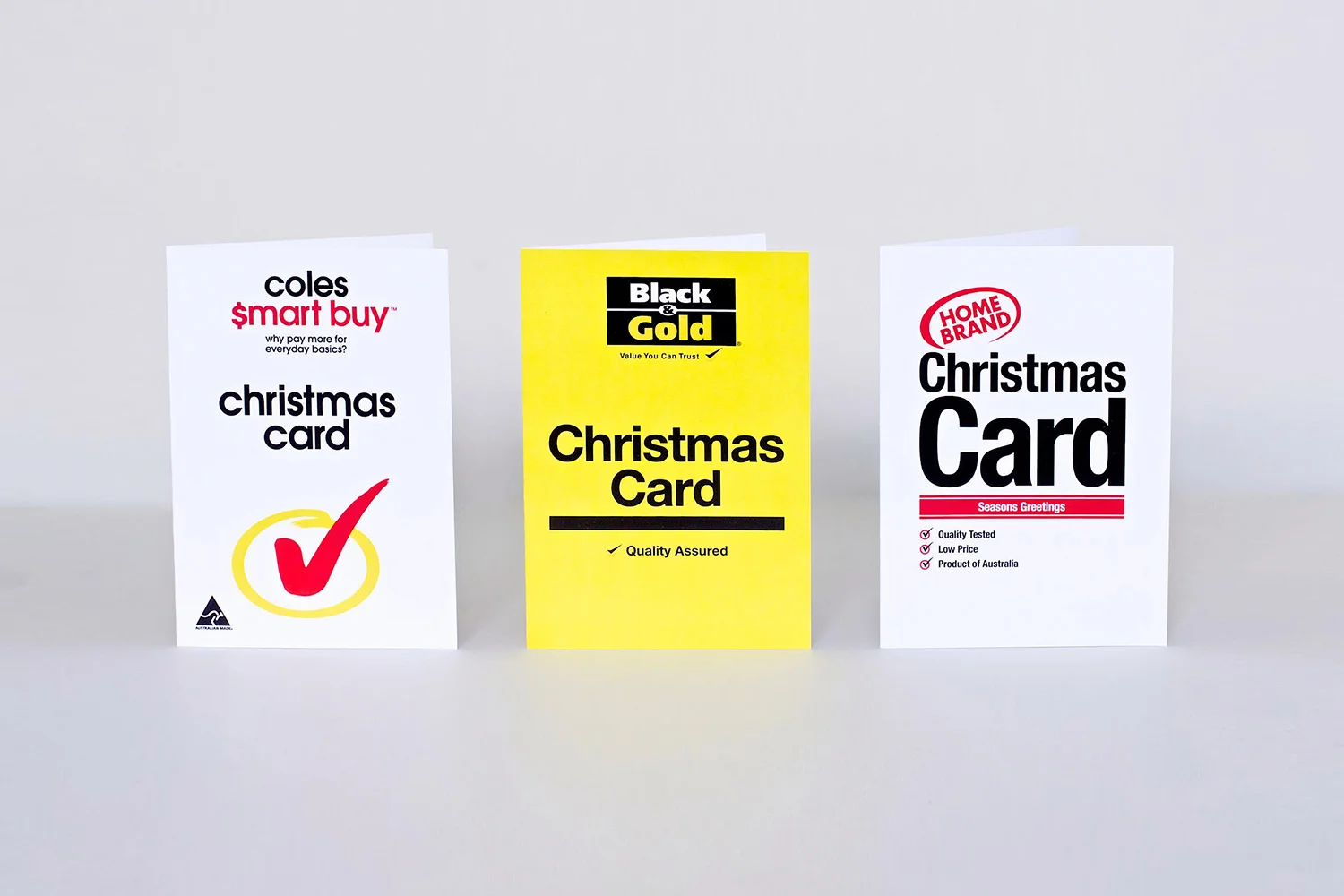
Home Brand Christmas cards
Sassen Design has created a range of supermarket home brand Christmas cards after being inspired by their highly functional and utilitarian layout. Happy Christmas from Sassen Design and enjoy the savings!
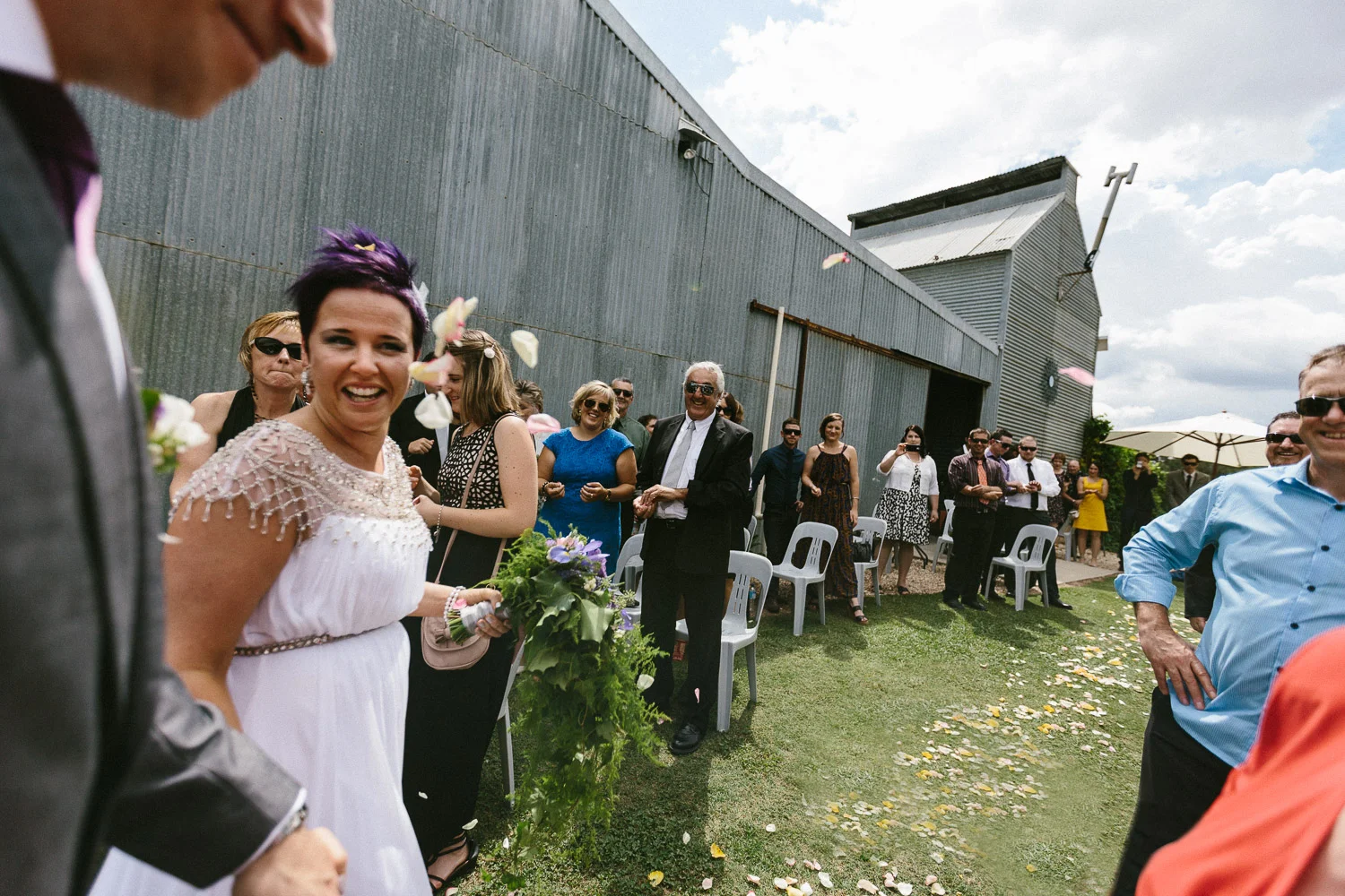
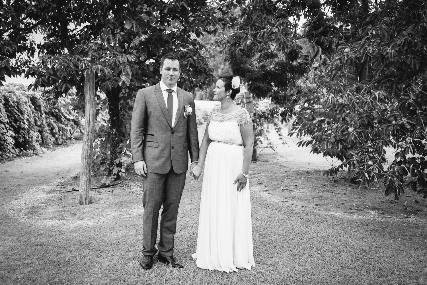
Holley + Mark
Wedding invitation design and photography for Holley and Marks wedding held at Remel. Remel was once a tobacco shed where the dried tobacco was piled to the ceiling in bales ready for sale. It has since been transformed into a function venue which also makes the ideal photography back drop.